
Tortoiseshell Properties: Rebranded
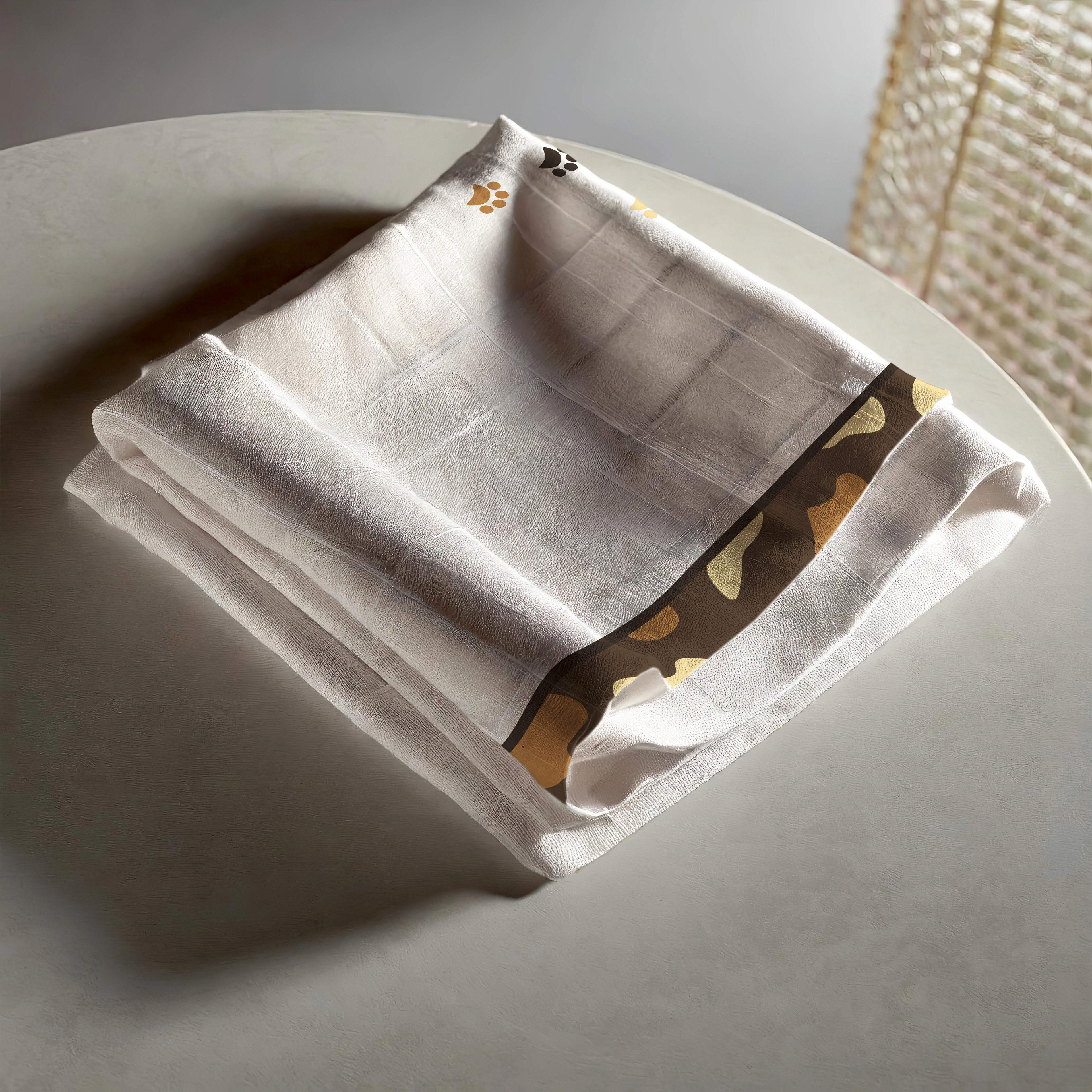
After I completed the official brand identity for Tortoiseshell Properties, which can be found on my website and Behance, I felt as though I could push the brand further. I got my chance to expand the branding during a college project, which this is the result of. For this rebrand, the cat elements were more emphasized in their identity. Additionally a few elements were added as hypothetical elements the company could include. The new logo can be found on all the company’s stationary as well as on several items such as a mug, candle, and dish towel- all of which would be complementary to any guest staying at one of their locations.
The updated logo features cat ears, a paw print in the O of "Tortoiseshell", and removes the LLC from the logo. The color palette and rough layout of the logo is the same as the original.


The updated business card remains roughly the same, except for featuring the new logo and adding a paw print to the word "Owner", as well as adjusting the leading of the type on the back of the card.
The letterhead, alternatively, was changed a bit more. The contact information was moved, and a colored bar was added at the bottom to better connect it to the business card and letterhead.


Finally, several possible gifts were mocked up for guests to take home. They use both the traditional logo and a mono-color logo. Additionally, the paw print design was incorporated into the dish towel.