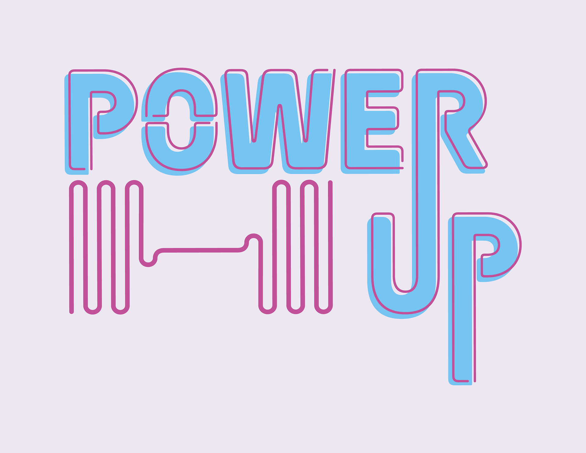
Power Up: Where working out is never a chore.
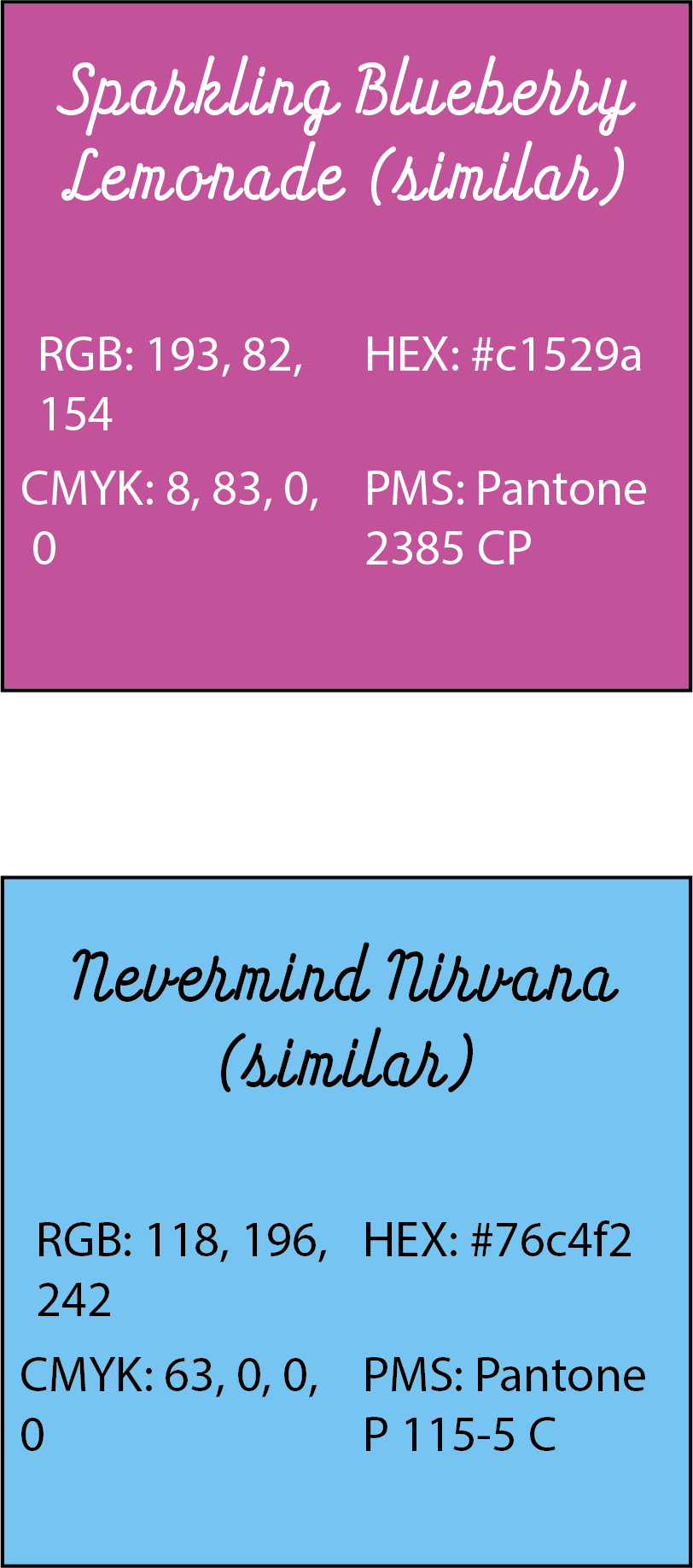
Power Up is a novelty gym that encourages people to work out using video games. The target audience are gamers that have a desire to work out but lack the motivation. Power Up allows customers to achieve personal goals for themselves and helps them find enjoyment in something they otherwise might not. The gym is not targeted towards people who have their own intense workout regiment, but rather people who are just starting out on that journey, or who want to work out more casually. Stylistically, the gym is designed to feel like an arcade as well as a gym. The environment should be welcoming and fun, and customers should feel supported by staff and want to keep coming back. This fun, casual feeling is depicted in Power Up’s logo, stationary, website, and advertisements. The color palate and neon-style typography evokes a fun, 80s inspired energy. The use of colors and asymmetric designs is intended to keep new customers from feeling intimidated, and instead excited to start something new.


The logo uses a modified version of the font Ohm Medium. Additionally, use of the font HT Neon can be found throughout various media pieces.
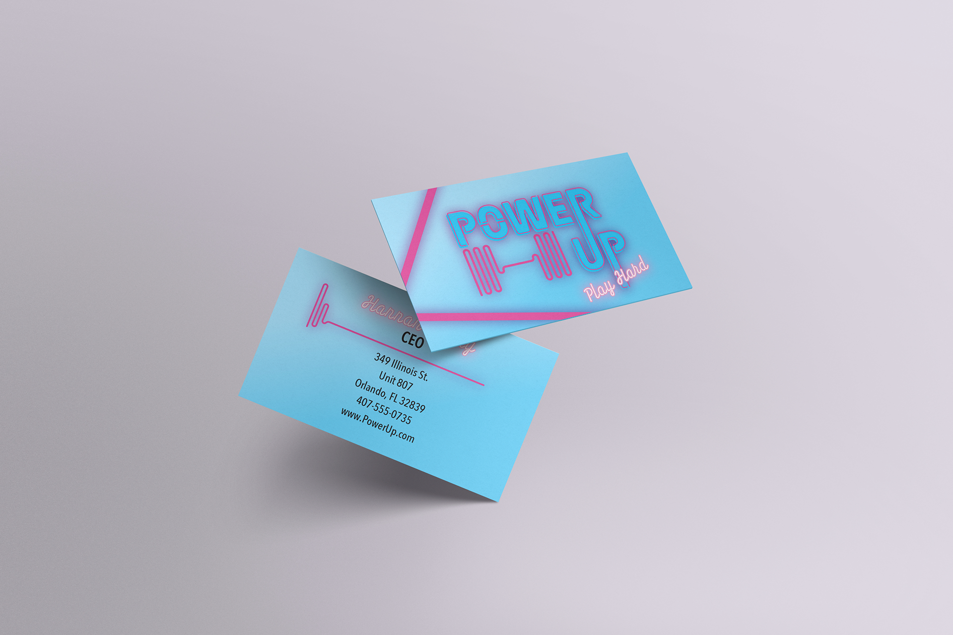
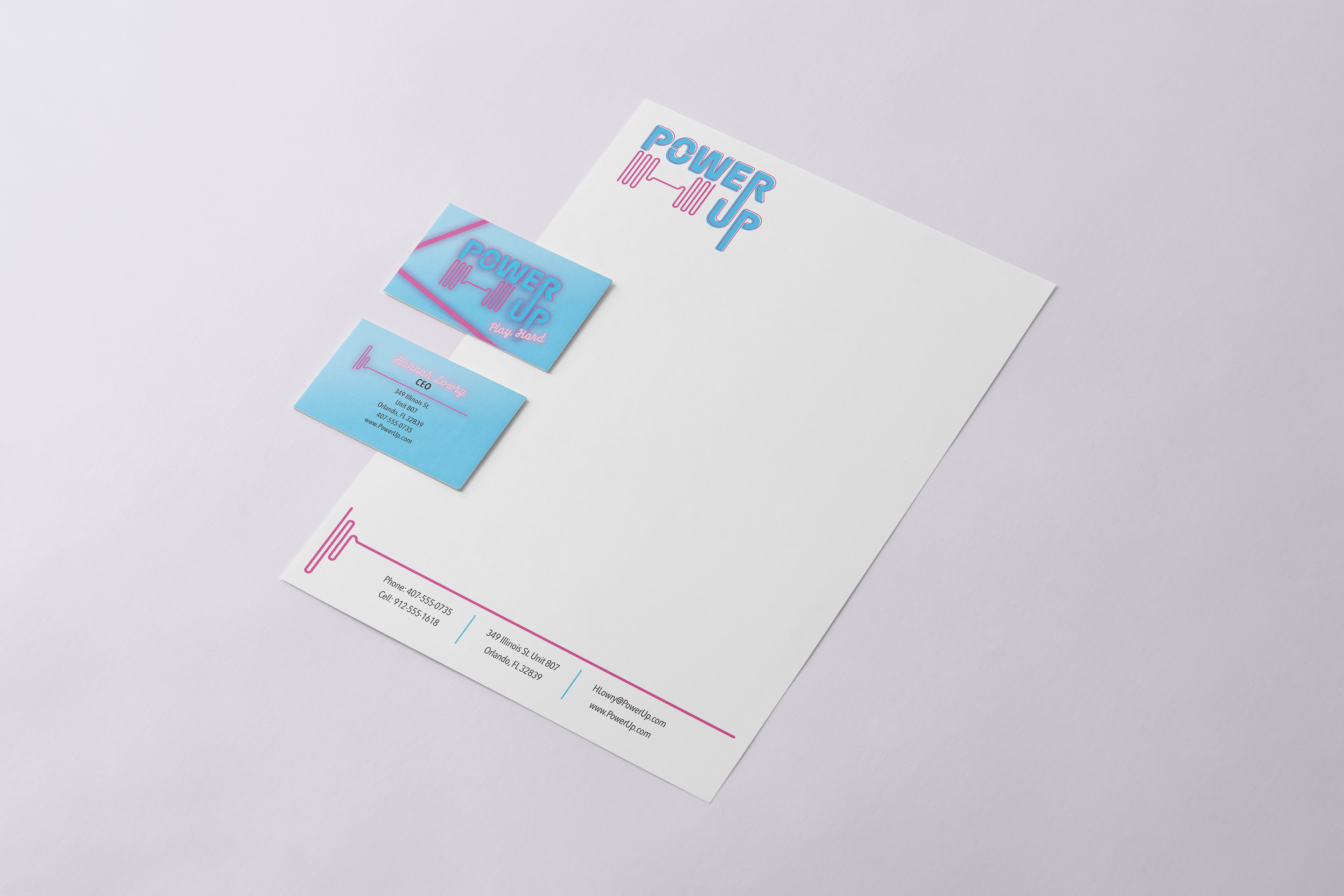
Although the main logo does not utilize any effects, a glow effect is added to the logo depending on the situation. For example, the business card utilizes a glow effect, but the letterhead does not.

A mockup of the home website was created, utilizing the secondary font as well as the glow effect previously mentioned and a custom Sign Up button.
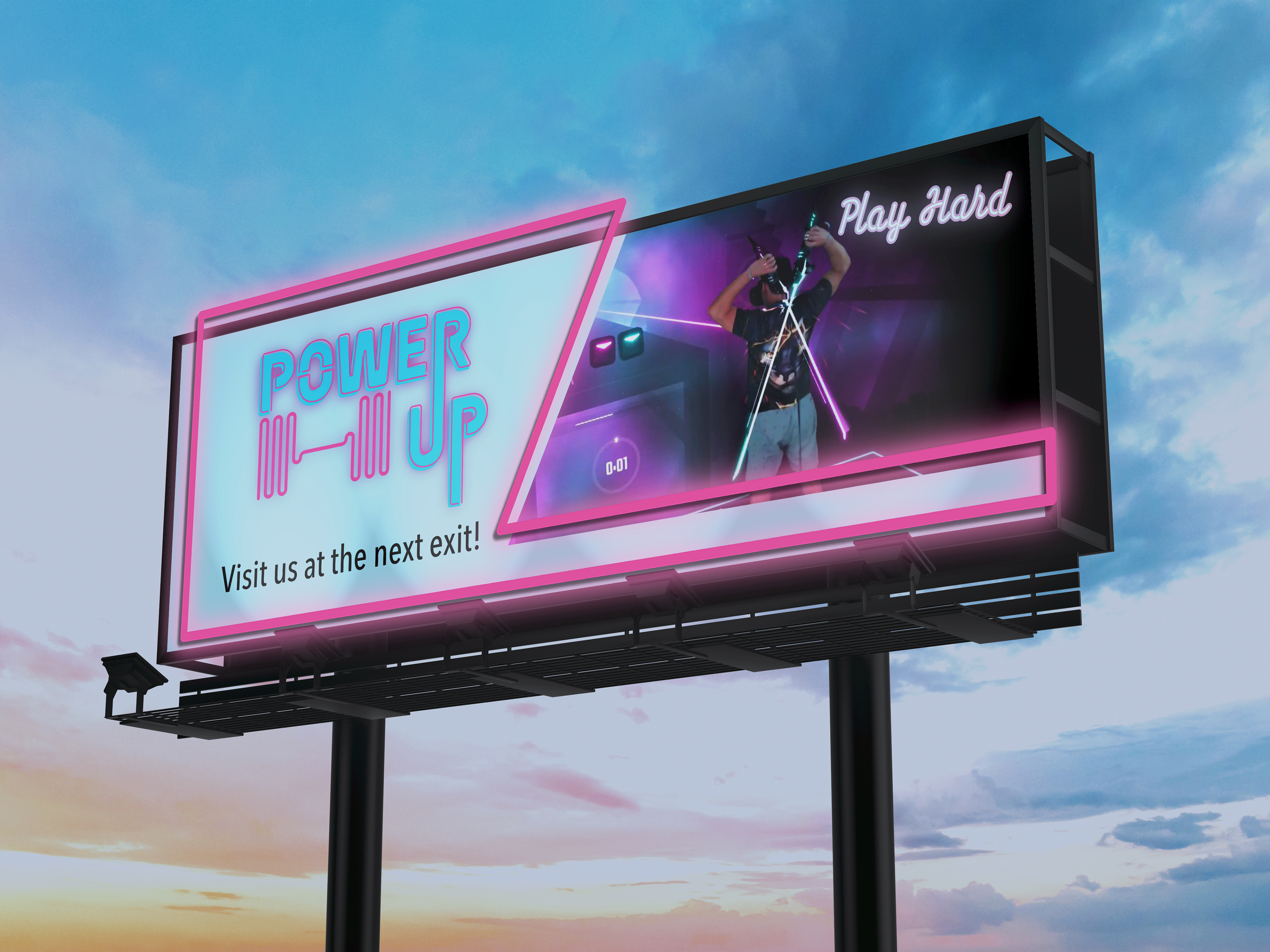

The advertising is the main location of the tagline "Play Hard" which highlights both the fun of playing video games and the energy exerted by the type of games used at Power Up.